Perler Bead Color Guide: Choosing Colors That Make Your Piece Pop
A practical method for fuse bead color choices: how many colors to start with, why lightness contrast beats hue variety, how to lay gradients along the palette, and which editor tools do the heavy lifting.

The same pattern can look refined or muddy depending on its palette. This guide is about repeatable rules, not inspiration: cap your color count, separate lightness, and always pick from the real bead palette.
Practice as you read
The editor ships a 290+ shade real bead palette — every rule here is verifiable live
Rule 1: Cap the color count
Color count is where beginners crash first. Every extra color means another purchase, another source of confusion, another misplaced bead:
- Cartoons / pixel characters: 15–25 colors
- Photo conversions: 30–50 colors
- Pure geometric decor: under 10
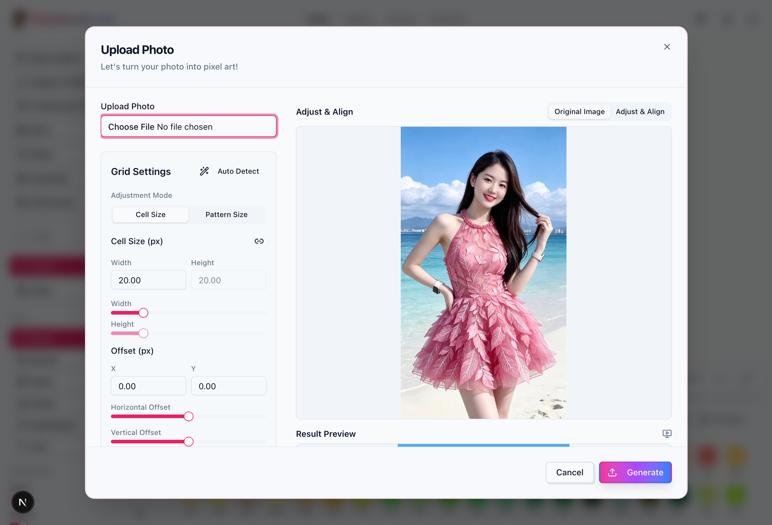
When converting an image in the editor, set the target color count up front and the tool merges similar shades automatically — faster and more even than deleting colors by hand.
Rule 2: Lightness contrast beats hue variety
At bead scale, a piece reads through its light-dark structure, not how many hues it uses. Twenty colors spread across three lightness steps beat twenty near-identical shades every time. Quick self-check: screenshot the pattern, convert to grayscale — if the subject still pops from the background, the palette works.
Practical: the three-step lightness method
- Subject: mid-tone base + highlight + shadow — at least three steps
- Background: a full lightness step away from the subject so neither eats the other
- Outline: black, dark gray, or a very dark variant of the base color to sharpen the whole piece
Rule 3: Lay gradients along the palette, not by feel
The classic hand-made gradient mistake is a missing step: two adjacent shades too far apart, leaving a visible band in the finished piece. Instead, pick consecutive codes within one color family. The editor’s color panel organizes 290+ shades by family across major brands, so a full gradient chain is one click away.
Rule 4: Pick colors for the bead store, not the screen
Screens emit light; beads are solid plastic. Close the gap with process:
- Only use palette codes — resist adding “custom colors” by eye
- For large backgrounds choose high-opacity standard shades; translucent beads look washed out in big fills
- You’ll burn through black, white, and gray faster than intuition suggests — restock them separately
Let the tools carry the rules
The editor’s color tools implement most of this guide: whole-pattern color replacement, color-count compression, and per-brand palette mapping. To start from proven palettes, browse works by color family in the gallery. And if your source image has messy colors, clean up outlines first with the free pixel-art upscaler.